
Company news
Digitec and Galaxus now available in dark mode
by Catherine Barth

The Digitec Community has been waiting for this moment for what feels like an eternity. For a long time, it was unclear whether it’d ever happen. Then, a brave team stepped up to the plate. Now, they’re proud to present cue rapturous applause... dark mode.
Digitec Galaxus has unveiled the dark version of its online shops. And let’s just say, implenting the feature took a tad longer than it did to write that sentence. However, we’re now finally able to announce its introduction.
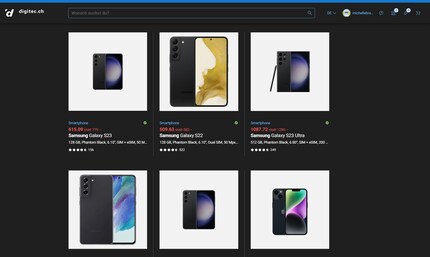
Naturally, dark mode is now available for you to use. If it hasn’t been activated automatically, you can enable it at the bottom of the page.
But why did it take us so long to make dark mode a reality? And why do we even need a dark version of our online shops? Taking the lead on the dark mode project were Lead UX Designer Leonardo Hauschild and Product Owner Tobias Grundman. In this interview, they explain why «the path to the Dark Side» was so long. After all, we couldn’t simply change all of our shop colours over night.
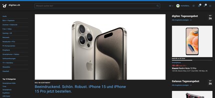
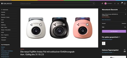
Tobias explains: «It definitely looks cool, but it can also be easier on the eyes. That’s true for evening use, as well as for people with night blindness (page in German). And if you’re using an OLED display, you can actually preserve your battery in dark mode. Of course, it’s also exciting to be able to implement something so rare – hardly any online shops out there have dark mode. In any case, the important thing is that there are enough users interested in it. The Community has been really vocal about it, which also played a crucial role in the decision.»
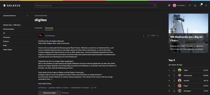
Leonardo explains: «We’ve been discussing dark mode internally for a number of years now. Projects like our widescreen initiative went on to lay the foundations. The goal of that project was to display our website correctly and in high resolution, even on large screens. This meant our engineers had to start tinkering with the layout of the website. Despite the scale and complexity of our shops, it gradually became clear that implementing dark mode was doable too.»
Tobias continues: «The project became a sure thing in June 2022. We estimated it’d take about 1,000 working days to implement. In cases like these, you need think carefully about whether it’ll be worth it. We also had to consider whether dark mode would actually be used in the end. There had to be concrete proof of that, so we did an analysis. This was intended to show how many users actually use dark mode on computers and smartphones. It turned out to be a total of 25-40 per cent of our users. So implementing the feature was worth it for a substantial proportion of people. Then, we were faced with the question of what it would take to implement.»
Tobias explains: «It’s not as simple as that, unfortunately. That’s why we have an entire team responsible for the visualisation of our online shops. Our framework team, which we call Team Infinity, mostly consists of frontend developers. They take care of the Digitec Galaxus website’s overall layout. This includes the website header, side columns and the footer. These elements, as well as all the other components of the online shop, need a predefined colour. Grouped together, these predefined colour schemes are referred to as «themes». Digitec and Galaxus use two separate themes that match the colours of their respective logos. Digitec’s theme combines a lot of blue and red and has a blue bar at the top. The bar at the top of the Galaxus website contains multiple colours, while the rest is primarily white, black and grey.»

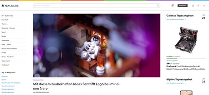
There are thousands of areas within our shops’ complex structure where colours are defined. More and more components have been added over time, with each being assigned an appropriate colour in the shop’s code.
It’s not always clear in every single part of the code which component is being referred to. «Background» is self-explanatory, but we’ve certainly got more than a few «buttons». And dark mode doubles that amount. You begin to lose track, and things get far too complex. That’s why we needed a system that could organise and assign colours efficiently.»
Leonardo adds: «During a separate project to develop a design system, we managed to break down a few obstacles, laying a good foundation for the dark mode project.»
«Sure,» Tobias replies. «But we also would’ve created constraints and complexity that wouldn’t have delivered the desired result. New elements have continuously been added over time, and having to tackle all those colour definitions manually would’ve created way too much capacity for error. So the code needed to be revised in order to automate colour assignment.»
Tobias explains: «It was our job to build a system that’d allow us to define colours for dark mode as well as the Galaxus and Digitec sites. From design, to development, to end result, it had to be super efficient – not a word you could use to describe our previous system. The new version was intended to completely replace the old one, allowing us to weed out as many errors as possible. To make sure we didn’t miss anything, the designers had to plough through all the components and determine which colour to use, right down to the very last elements.»
Leonardo knows exactly what I’m talking about: «We’re an online shop. So obviously, our site consists of a huge number of product images. Each product appears on a white background. This is something we’d been grappling with for a while because this issue is really important to us. If you have a black product on a black background, the item’s contours and shades are difficult to see. The best result in terms of user friendliness is actually a white background. That’s why we’re sticking with this version for now.»
Tobias stops to think for a moment: «I can’t quite give you a definitive answer on that yet. I think it was round about 700 days, give or take. But we’ve only just come to the most crucial part. We’ve now made dark mode available to our Community. I’m excited to see what they make of it. Virtually turning the display dark at the push of a button is a pretty aggressive change, and mistakes could always creep in. That means Galaxus and Digitec are counting on frank, high-quality feedback from the Community to help us put the finishing touches to dark mode.»
What a great way to wrap things up. Thanks very much to both of you! All I can say is: dark mode awaits!
So, good folks of the Community, it’s your turn now. What do you think of our dark mode? Tobias, Leonardo and everyone in our UX Design and Frontend Development Teams are keen to read your feedback in the comments.
Ever since I learned how to hold a pen, I've been doodling away in bright colours. Thanks to my iPad, digital art has also become part of my life. That's why I love testing tablets – from the graphic design range to the regular kind. When I feel the urge to express my creativity without lugging lots of equipment, I go for the latest smartphones and start snapping away.
Interesting facts about products, behind-the-scenes looks at manufacturers and deep-dives on interesting people.
Show all